Scientific Reasoning
19 Dealing with Statistics
Section 1: Introduction
In this unit, we will take a look at some of the distinctive reasoning that goes on within the sciences. We will not to learn how to engage in these complicated reasoning tasks ourselves (after all, these often involve specialized techniques for inquiry and problem solving). Instead, we want to get a better sense for some of the common techniques used across the sciences, and thereby put ourselves in a position to think a bit more critically about some of the scientific claims that we run across in the news and elsewhere. We will start with the use of statistics. We have already talked about statistics in our discussion of statistical generalizations back in Chapters 14 and 15. As we will see, statistical generalizations are just one kind of statistic—though an especially important one. The goal, in this chapter, is to get a better sense for what a statistic is, and to look at some common pitfalls in understanding statistics and their visual representations.
Section 2: Statistics
A statistical claim is traditionally defined as a statement expressing a numerical fact, and we will take this definition to include vague numerical statements that use terms like ‘most’ or ‘few’. Just as there are all kinds of numerical facts, there are all kinds of statistical claims. For example, a statistical claim might simply tell us how many things of some kind there are, as in:
- There are 3 eggs left in the fridge.
- The University of California System awarded 55,350 Bachelor’s degrees in 2017-18
While statistics like these are important, often we are concerned with statistics that tell us something about a whole group. Averages are statistical claims, and so are generalizations.
- The average score on the exam was an 83.
- 39% of high-school graduates in Greenville go on to enroll in college.
Similarly, we might be interested in statistics that are comparative. Comparative statistics give us a numerical measure of how much something has changed, or how two different groups are related. For example:
- Sales have decreased 8% from last quarter.
- Citations for driving under the influence (DUI) have gone up 90% under the new mayor.
- Teen pregnancy rates in Greenville are ½ of what they are in Bluefield.
Precise statistical claims often carry a special authority, and this makes it particularly important to understand what they are saying. We have already looked at statistical generalizations, and we have a reasonably good sense of what counts as a good statistic of this kind. As it turns out, statistical claims come in many different forms, and we will not be able to discuss each kind individually. Nonetheless, we can talk about some general strategies for understanding statistics, as well as some questions to keep in mind when it comes to some of the more common kinds.
Section 3: A Key Question for Understanding Statistics
When we look at a statistical claim, the most important thing to remember is that this information has been collected by one or more people. As Joel Best puts it in his book More Damned Lies and Statistics:
[W]e tend to assume that statistics are facts, little nuggets of truth that we uncover, much as rock collectors find stones. After all, we think, a statistic is a number, and numbers seem to be solid, factual proof that someone must have actually counted something. But that’s the point: people count. For every number we encounter, some person had to do the counting. Instead of imagining that statistics are like rocks, we’d do better to think of them as jewels. Gemstones may be found in nature, but people have to create jewels. Jewels must be selected, cut, polished, and placed in settings to be viewed from particular angles. In much the same way, people create statistics: they choose what to count, how to go about counting, which of the resulting numbers they share with others, and which words they use to describe and interpret those figures.[1]
Best’s point is that people collect and “polish” statistics, and so although a statistic might accurately report some quantity, it will also reflect the interests and motives of the people who originally collected the information. After all, any statistic is the result of a person or group of people deciding to count something in particular, and deciding to pursue that information for the sake of some goal. One important consequence of this is that in order to really understand a statistic, we have to understand what it was so important to count. That is, we need to ask:
A Key Question for a Statistic:
- What, exactly, was counted?
While this probably sounds obvious, people regularly misinterpret statistics because they are not clear about the subject of the claim. To illustrate, take the generalization above that 39% of high-school graduates in Greenville go on to enroll in college. Many people would regard this number as unacceptably low, and this is the kind of statistic that might move a community to make substantive changes to its educational system. However, before taking action on this basis it is important to fully appreciate this statistic. So let’s ask the question above: what, exactly, was counted in this case? Well…high school graduates who enrolled in college. But how is the term ‘college’ being used here? For example, what kind of college are we talking about—was this limited to 4-year institutions, or did they count community colleges or trade schools? What time frame were they working with—did they count only those graduates who enrolled immediately after graduation, or do these numbers include people who decided to take a year or two off? What does ‘enroll’ mean? Does it mean that they counted only those graduates who enrolled as full-time students, or did they count part-time students as well?
Getting answers to these questions is crucial to understanding the significance of this claim. If the author of this statistic was counting only those graduates who immediately enrolled as full-time students at 4-year colleges, then this statistic tells us a lot less than we might have thought. If, on the other hand, the author was counting those graduates who enrolled as part-time or full-time students at 2 or 4 year institutions in the 3 years after graduation, then this statistic is quite telling.
Here is another example which shows the importance of understanding the relevant terms in a statistic. In March of 2014 the following headline appeared in Time magazine: “U.S. Autism Rates Jump 30% from 2012”.[2] The story reports the findings of a recent study by the Center for Disease Control (CDC). What should we make of the statistical claim in the headline? It is easy to read this as saying that there has been a dramatic increase in the number of people with autism in just two years, and to worry, consequently, that we are in the middle of an epidemic. We need to be careful, and to think about what is being counted here, however. Whether a person has autism spectrum disorder (ASD) is something that must be diagnosed by a professional. Accordingly, in order to produce the statistic above researchers from the CDC did not count people with ASD, but counted people diagnosed with ASD. Consequently, what the statistical claim tells us is that there has been a dramatic increase in the number of people diagnosed with ASD in the last two years. However, this fact does not necessarily mean that there has been an increase in the number of people with autism. After all, a person can have ASD without having been diagnosed. The authors of this study attributed this increase at least partially to (i) changes in the medical definition of ASD which broadened its application and (ii) the fact that people with ASD are more likely to be diagnosed than in the past.
This particular statistical claim offers another lesson. The authors of the study were careful to warn against generalizing too far from their results. They wrote: “Because the [sampling technique does] not provide a representative sample of the entire United States, the combined prevalence estimates presented in this report cannot be generalized to all children aged 8 years in the United States population”. Despite this warning, many news outlets reported this story as if the researchers had concluded that there had been a 30% increase in autism rates among all American children.
Here is one final example. Filtered water stations are marketed as way to reduce plastic bottle usage, and some include a digital counter that keeps track of how many disposable plastic bottles the station has “helped to eliminate.” This is a statistic, so let’s think about what is being counted here.
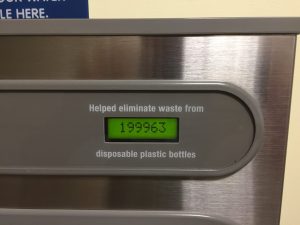
Well, it is not actually counting the bottles this station has helped eliminate. In order to count those bottles the machine would have to know when a person has filled up at the station instead of buying a new disposable plastic bottle of water. But the machine does not know a person’s reasons for filling up their bottle or what they would have done. All the machine “knows” is the volume of water it has dispensed, and this is what the machine is actually counting. That is, the statistic the station can accurately report is that it has dispensed a volume of water equivalent to 199,963 disposable plastic bottles, something very different from what the machine actually claims. Has this machine helped eliminate waste from some plastic bottles? It almost certainly has, but ‘some’ is about all we can say in this case (and ‘some’ doesn’t look very good on a digital counter!). While this is a fairly minor inaccuracy, it is not difficult to see how it might lead to wider errors. Imagine, for example, somebody arguing that the filtered water system was worth the cost on the grounds that it prevented almost 200,000 plastic bottles from being used. Returning to the wider point, these examples show that we are not in a good position to understand a statistic if we don’t know what its terms mean, and consequently what, exactly, has been counted.
Section 4: The Average is not Necessarily Typical
Averages are among the most common statistics we come across on a day-to-day level. Although we all know how to find the average (or mean) of a set of numbers, we do not always understand what an average is telling us. We tend to use averages as a quick way to characterize a whole body of information, and to interpret the average in terms of what is common or typical. Sometimes this works, and the average really does give you a good sense for what is common. Take height, for example. The average height of women in the U.S older than 20 is 5 feet 4 inches, and this is a very common height. Most women in the U.S. cluster around 5’4 and the numbers fall off as you get significantly taller or shorter from this point.
However, this does not hold for all averages. An average is a simple way of summarizing numerical information, and does not capture the way the information varies. For example, say that you are moving to a new city and are looking to rent an apartment in a neighborhood you don’t know much about. As you look around online, you run across the following statistic: “in this area rent averages $850/mo.” You might conclude on this basis that you’d have to pay roughly $850 for rent. That is, you are thinking that rents in this neighborhood look something like Diagram 1 below:
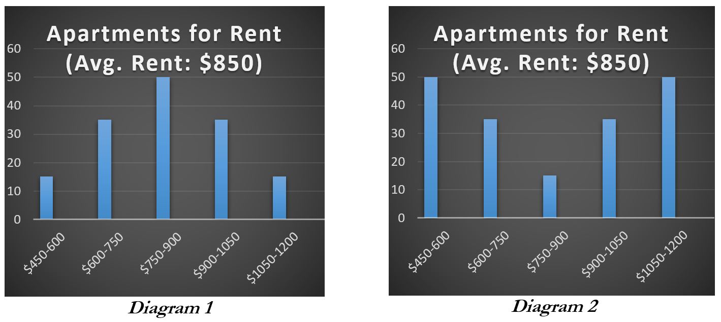
Maybe, but this fact alone certainly doesn’t guarantee this. In fact, it may be that there are few if any apartments that rent for around this price. Say the area is pretty clearly split between more and less desirable areas. In the less desirable areas rent might run around $600, but closer to $1100 in the more desirable areas. In this case, your choice is likely to be between paying $600 and paying $1100 even if the average is $850 as is represented in Diagram 2. This illustrates that the same average rental price is consistent with very different rental markets, and this holds more broadly. Knowing the average of a set of numbers alone doesn’t tell you about how those numbers vary or are distributed, and this can make a big difference.
To give a final example, imagine you are interviewing for a new job. The boss tells you that employees are on track to get year-end bonuses averaging about $1500. That sounds pretty good, and you start thinking about what you could do with the bonus if you took the job. But, again, it does not follow that you’d get anything close to $1500. If, for example, company executives got giant bonuses, then the average might be $1500 even though most employees got a much smaller bonus. In this case, a few very high bonuses will dramatically raise the average. The executive bonuses are outliers—they are numerical values that differ significantly from the bulk of the other values in the group. The presence of outliers can pull an average away from what is common or typical. The take-away from these examples is that averages all by themselves do not necessarily tell you about what is common or typical. Importantly, knowing this puts you in a position to ask effective questions. So, in the interview case, you might say: “that bonus sounds great, but what is the projected bonus for a person in the position I am applying for?”
Section 5: Comparative Statistics
Another common type of statistic compares one numerical value with another. To illustrate, imagine a headline: “Murders top 40 for the first time in the City’s history”. The story goes on to report that more murders were recorded this past year than any prior year, and is accompanied by the following graph.
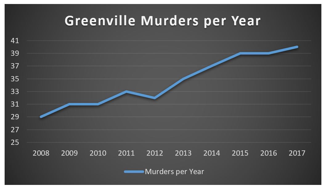
Like all graphs, this one compares statistics. Specifically, it compares the number of murders in Greenville on a year-by-year basis, and when we look at this graph we have to admit that this looks bad. A graph like this might lead you to think that crime in Greenville is getting worse, and that something needs to be done to address this growing problem. Maybe it does, but the comparison represented by this graph is meaningful only to the extent that it is comparing relevantly similar statistics.
In order to illustrate this point, let’s add to the scenario that the population of Greenville has increased dramatically during this interval—from around 580,000 to 775,000. In this case, the graph is comparing the murder rates for different sized communities. For example, the number of murders in 2008 was 29 when Greenville had about 580,000 people. To straightforwardly compare this number to Greenville’s 40 murders in 2017 when its population was 775,000 misses something important. The reason for this is that you would automatically expect more murders in a bigger city (all things being equal).
If you want to compare murder rates in Greenville from year to year, then you need to find a way to make the yearly murder statistics similar enough to compare them. One way to do this is to find the per capita murder rate. The per capita murder rate is the number of murders per person. In 2008 Greenville had a population of 580,000 people and 29 murders, and this gives us a per capita murder rate of .00005 (dividing 29 by 580,000). We can do this for each year and then compare the per capita murder rate. Doing so gives us the following graph:
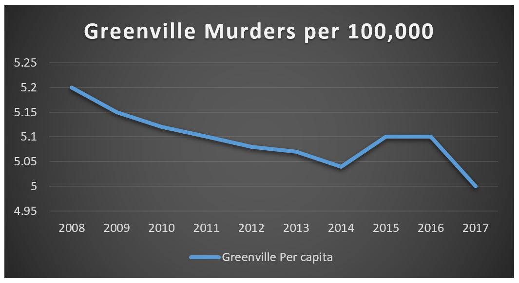
This graph shows that despite the increase in the number of murders in Greenville, overall the murder rate in Greenville has gone down.[3] Even though there were more murders in Greenville in 2017 than in 2008, overall there are fewer murders per capita.
Given only the first graph, citizens of Greenville might be alarmed. However, when compared appropriately these numbers tell a very different story. The point of this example is to show that it is important to compare apples to apples; comparative statistics are meaningful only to the extent that the comparison makes sense—and at least sometimes it does not.
One other point to make about comparative statistics has to do with comparing percentages in particular. For example, suppose you hear from a reliable source that regularly taking small doses of aspirin doubles your chance of developing a stomach tumor. This sounds terrible, and suggests that if you are a regular aspirin user, then you should stop taking it. However, in fact, by itself this information does not justify this conclusion—after all, you don’t know the chances of getting a stomach tumor in the first place. Suppose that the probability of developing a stomach tumor in your lifetime is 1 in 200,000. If regular aspirin consumption doubles your chances, your probability of developing a tumor will be 1 in 100,000. This is still pretty unlikely; in fact, it matches the probability of dying in a parachuting accident. However, many people are willing jump out of airplanes fully knowing the risks involved, and so too a person might be willing to live with this level of risk of developing a stomach tumor for the sake of the benefits provided by aspirin.
Section 6: Scale
Another important characteristic to keep an eye on when it comes to understanding graphs is scale. On a graph the scale is a numerical interval or gap that is used to represent quantities on one of its axes. In the example above, the scale for the vertical axis (or y-axis) is murders per capita and the horizontal axis (or x-axis) is a time scale measured in years. The scale is an important, and easily overlooked, element of a graph and is crucial for understanding the significance (or insignificance) of the information provided. Moreover, it is important to remember that even when a graph objectively reports the facts, it is a representation of those facts chosen by one or more people. In creating graphs, people not only choose what information to present, but also how to present and frame the information. These choices, and in particular choices about scale, can make changes or differences seem more or less significant than they really are. Consider the following example. The local school board is interested in the percentage of high-school students who participate in extra-curricular activities because they think it reflects student attitudes about school more broadly. In response to their request for information, the school system’s administration gives them the following graph:
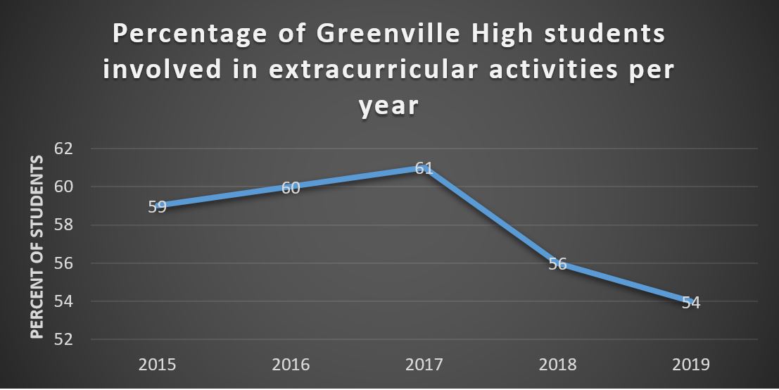
Presenting the information about participation using this graph makes it look as if the percentage of students who participate in extracurricular activities has fallen off significantly in the last couple of years. This graph suggests this by fitting the scale to the changes in participation. Consequently, the scale visually highlights the decline of the last two years. Consider this alternative, however:
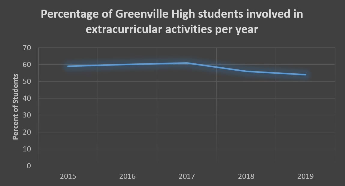
Importantly, this graph represents exactly the same information. The only difference is that the vertical axis has been changed to go all the way to zero. Constructing the graph using this different scale highlights the relatively stable percentage of students involved in extracurricular activities at Greenville High and thereby minimizes the visual impact of the changes. It shows a decrease, but relative to the overall percentage of students involved, the change appears modest.
The fact that we can change the visual impact of a graph in this way automatically raises the question: what scale should the graph use? There is no one-size-fits-all answer here. What determines the appropriate scale will depend on what would count as a significant or important change or difference when it comes to the specific factors being compared. To illustrate, consider a very different case: levels of CO2 in the atmosphere. A change as seemingly small as 100 parts per million (.01 percent) to the level of CO2 in Earth’s atmosphere is meaningful and can have significant consequences. As a result, a graph measuring global CO2 levels should have a scale that shows changes of this degree to be visually significant as well (so, for example a scale with intervals of 10 or 20 parts per million). Alternatively, we might consider the United States annual defense budget. This budget is measured in the hundreds of billions of dollars, and so a scale with intervals of even 1 million dollars would be too fine grained to capture changes in this budget over time.
As a final point, often the significance of a change or difference becomes clearer given more information. To use the example of Greenville High again, the significance of the recent dip in participation in extracurricular activities might become clearer by looking at the last 10 years of data instead of only the last 5 as follows:
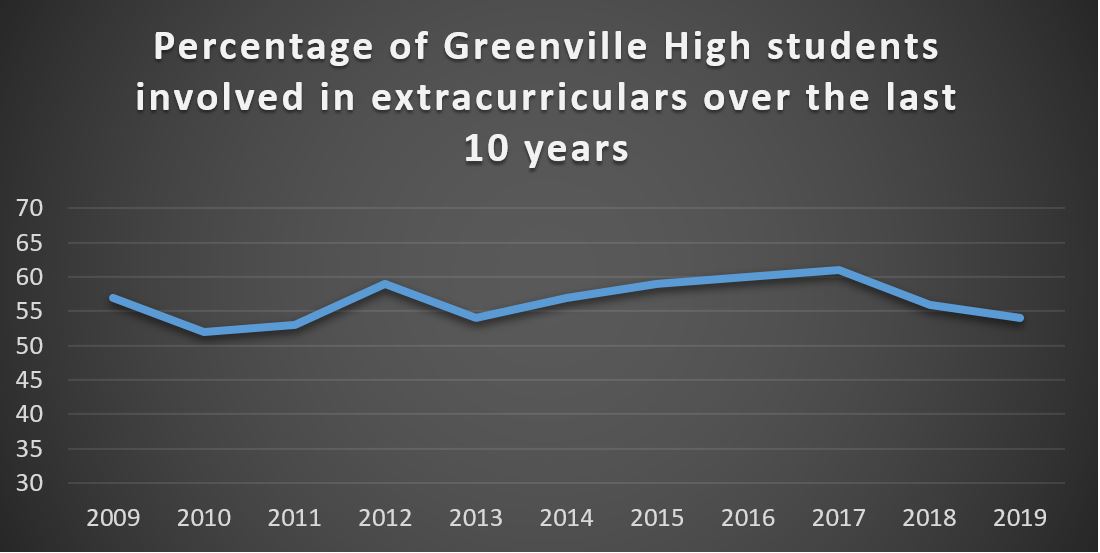
This additional information shows that the participation rate has varied from about 50% to about 60% over the last ten years. The recent drop in participation to 54% is still well within what has been normal at the school. Indeed, this new information highlights that extracurricular participation was especially high in 2017 (as opposed to especially low in 2019). Notice the change in scale as well. Although there are surely other variations of scale that are appropriate, running the interval from 30 to 70 in increments of 5 allows the reader to see the changes in participation without making these changes seem overly significant in light of the available information.
Exercises
Exercise Set 19A:
#1:
Give an example of an interesting or important non-comparative statistic.
#2:
Give an example of an interesting or important comparative statistic.
Exercise Set 19B:
Directions: For each of the following, say (i) what this statistic initially implies or suggests to you, and (ii) give at least one reason the statistic, as stated, might be misleading.
#1:
“Police officer deaths on duty have jumped nearly 20%.”
#2:
“Illegal border crossings have fallen 81.5 percent since 2000.”
#3:
“The number of homeless students in Seattle has increased by 55% since 2012.”
#4:
“The state’s unemployment rate is at its lowest level in 10 years.”
#5:
“The average full-time working woman earns 78 cents for every dollar a man earns.”
#6:
“Rates of violent crime in our state are twice that in a neighboring state.”
Exercise Set 19C:
#1:
Imagine that you’ve been asked to create a graph that represents changes in average price for unleaded gasoline over time in your city. What would be an appropriate scale to use? Why would it be appropriate?
#2:
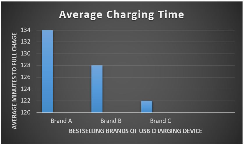
Brand C makes USB charging cords for phones and other devices and features this bar graph in their advertisement. Evaluate this graph.
#3:
Find a graph in the news or on social media that is being used to support or illustrate a particular claim. Copy and paste it here, and then comment on its scale(s). Does the scale make sense? Why or why not? Be prepared to share.
- Best, Joel. (2004). More Damned Lies and Statistics. Berkeley, CA: University of California Press, xii-xiii. ↵
- Park, Alice. (2014, Mar. 27). “U.S. Autism Rates Jump 30% from 2012.” Time. ↵
- In order to avoid all the decimal places, the graph represents the murder rate per 100,000 people. Doing so allows us to present the rate in terms that are easier to read. ↵
